
The system allows you to customize graphs to display on your dashboard in the admin portal. This way you can adapt the broad capabilities of our system to the specific needs and metrics your campaign wants to focus on. For example, you can track the growth rate of support in different sub-groups of voters or see what percentage of the population your team marked as supportive of your candidate in a particular neighborhood.
Guide to Custom Graphs
First, you need to go to the Advanced Search page in the admin portal, run a search based on your desired criteria, and then save it to your favorites.
- Go to the advanced search page in your admin portal.
- Perform the relevant search from which you want to generate a graph.
- Click on the star icon to save it as a favorite search.
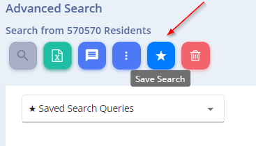
The dynamic graph will be generated from the search results of the preferred search you selected.
- Go to the main Dashboard page in your admin portal and click on the
 button in the top row. The following pop-up will open:
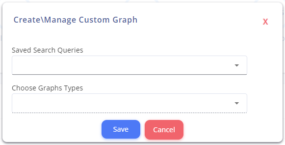
- Select a preferred search to generate the content of the graph. For example, a graph of all supporters in Elmsford.
- Graph Type – You can choose whether the graph will be the format of a pie chart or a growth rate (quantitative) chart.
- Group by Parameter – In the case of a pie chart, you need to select the parameter by which the graph will be created. You can choose multiple parameters, and a separate graph will be generated for each one.
To illustrate this, we will create two graphs:
- “Supporters in Elmsford” growth rate chart
- “Residents of Port Chester” pie chart by the support status parameter
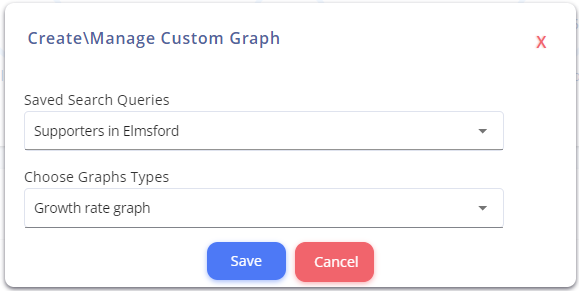
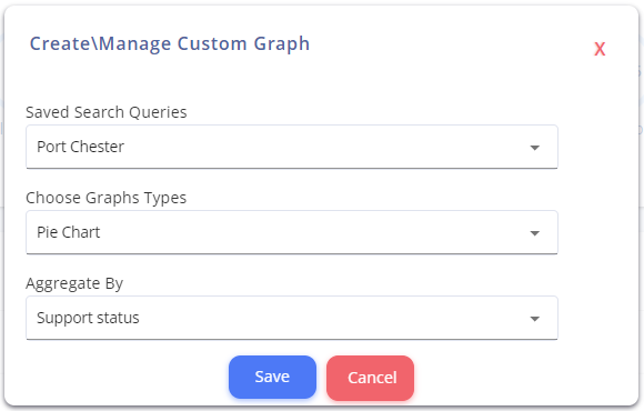
If we want to add another graph to the screen, we will also mark it in the checkbox under “Manage Custom Graphs,” and if we want to delete the graphs we created, we need to uncheck the checkbox.
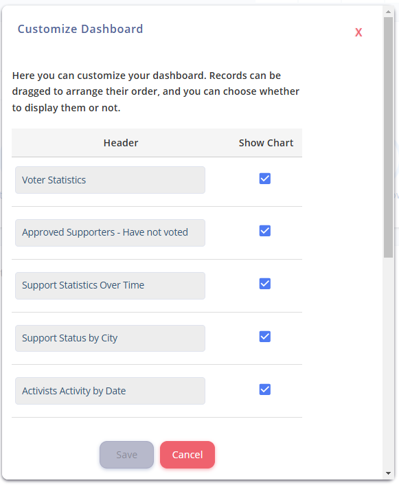
Now you can see the generated graphs on the main page:
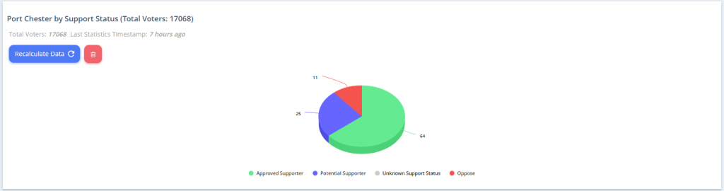
Try it out, and see how custom graphs can help you stay on target!